


Call me a contrarian, but in an age where flash and volume seem to be more popular than ever when it comes to branding and marketing, I am increasingly a fan of subtlety and modesty. Of the dozens of hats I've bought from golf courses, the ones I wear most tend to have just the course's logo on the front. This places all of the focus on that icon, and specifically the lack of wording makes it a potential conversation-starter (lately from a safe social distance, of course).
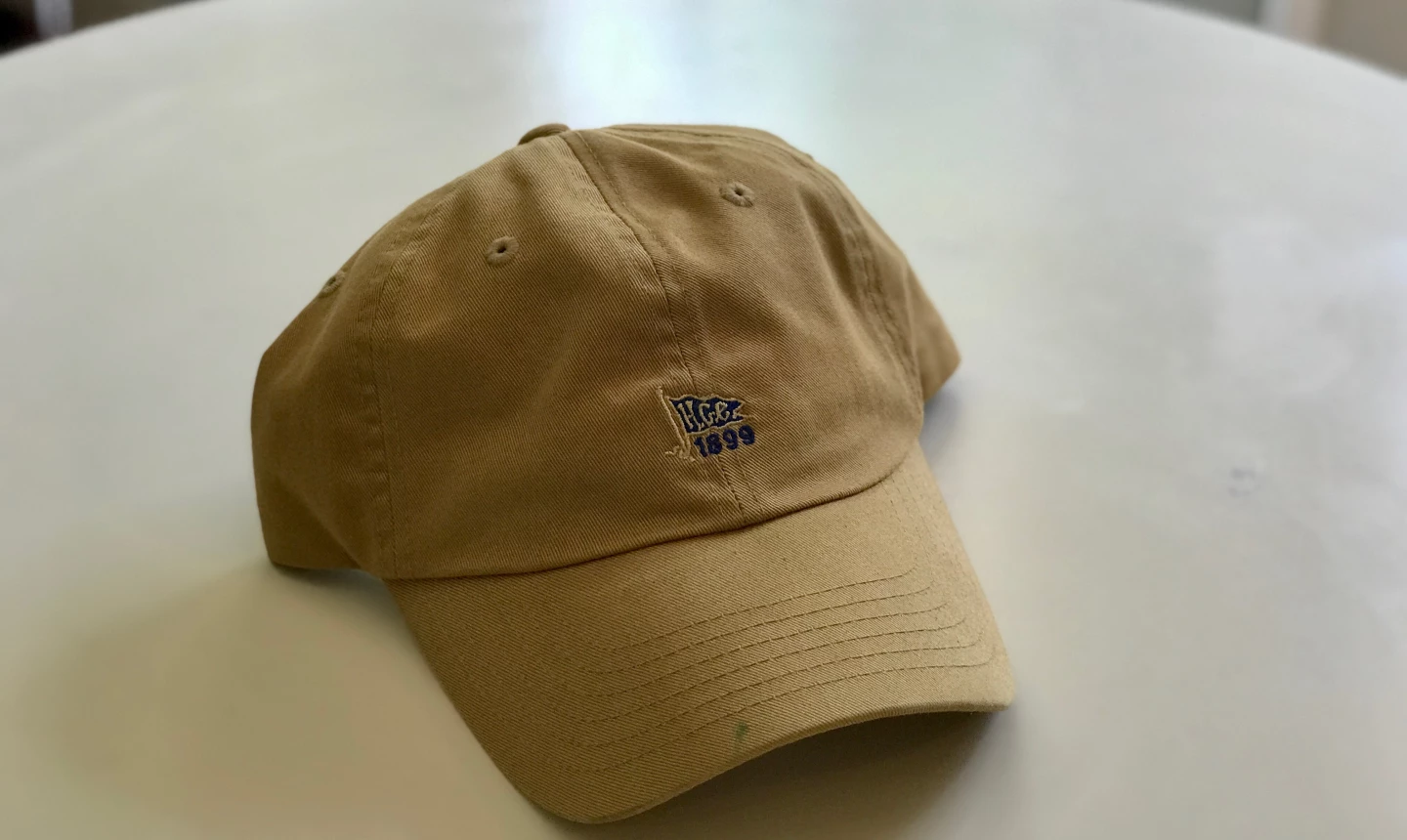
One of my favorite acquisitions from a course I've visited is from Hackensack Golf Club in Oradell, N.J., a Charles Banks design where my friend Adam and I teamed up to compete in the first-ever qualifier for the first-ever U.S. Four-Ball Championship. The club's logo itself is relatively straightforward: a tapered flag with a blue background and the letters "H.G.C." emblazoned on it. The hat I bought has only the club logo against a deep khaki background. Appealingly, it is scaled down relative to what one might normally see (and to other hats I recall passing up in the pro shop before this one caught my eye). I'd say it takes up half to two-thirds the real estate other club logos normally use.
I like the contrast this paints to the recent trend I've seen in golf club hats, toward chunkier, flashier assertions of a particular brand identity, even at prestigious private clubs. The hats with the big letters "RIV" on them for Los Angeles' Riviera Country Club seem to be in the vanguard of this movement. I'd personally be partial to a hat with the club's simple 'R' logo, the smaller the better.


Comments (6)
The smaller the logo the better. I believe a small logo shows more class.
Why pay $25 to walk around with a giant manufacturer ad on your forehead?
The smaller the logo the better. I believe a small logo shows more class.
Why pay $25 to walk around with a giant manufacturer ad on your forehead?
Subtle is class!
I suggest you check out logo for Sand Hills Golf Club - Nebraska